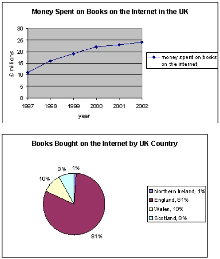
The line graph provides information about the amount of money incurred on online book shopping in the UK from 1997 to 2002,while ,the pie chart ilustrates four UK countries in terms of the proportion of books bought online.
It obvious that line graph to spend money on books from the Internet significantly increased. The pie chart illustrates the England had highest percentage of buying books online than other 3 countries
As we can see by line graph, in 1997, money spent on books on the internet was 10 million. Over the next three years, that number rose to 5 million, and in 2000 to around 25 million. Between 2000 and 2002, spending on books grew more slowly.
The pie chart shows that the highest rate of online book purchases is 81 percent. The remaining 3 UK countries accounted for 10 percent in Wales, 8% in Scotland and 1% in Northern Ireland.
Anonymous5 years ago
how many words
?
Leave a reply
FREE IELTS LEVEL CHECK
Take our 5-minute IELTS level check and receive a detailed report highlighting the areas where you need to improve the most to achieve your target IELTS score.

The line graph provides information about the amount of money incurred on online book shopping in the UK from 1997 to 2002,while ,the pie chart ilustrates four UK countries in terms of the proportion of books bought online.
It obvious that line graph to spend money on books from the Internet significantly increased. The pie chart illustrates the England had highest percentage of buying books online than other 3 countries
As we can see by line graph, in 1997, money spent on books on the internet was 10 million. Over the next three years, that number rose to 5 million, and in 2000 to around 25 million. Between 2000 and 2002, spending on books grew more slowly.
The pie chart shows that the highest rate of online book purchases is 81 percent. The remaining 3 UK countries accounted for 10 percent in Wales, 8% in Scotland and 1% in Northern Ireland.
how many words
?